ServicePRO Web - Portal Designer - General
Return to the ServicePRO Web or Portal Designer navigation page.
Contents [hide]
Overview
The General section allows users to update the following features and options in ServicePRO Web:- User Sign in options
- UI color schemes
- Logos
- Company support information
Accessing Portal Design – General
General section can be accessed by selecting the Portal Designer option from the left side bar, then selecting General.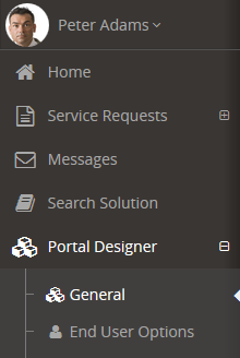
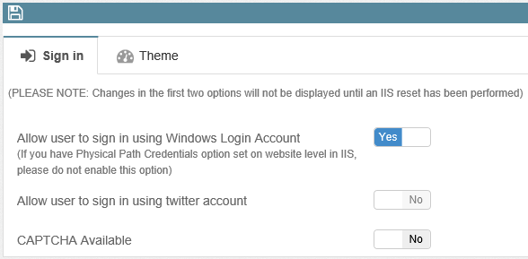
Sign In Tab
Enable or disable options associated with the Sign In page when starting up ServicePRO ServicePRO Web. Please note that enabling or disabling account logins will be updated after the IIS is reset.- Allow users to sign in using Windows Login account – Enable or disable Windows Login with ServicePRO ServicePRO Web. A Windows icon and hyperlink will be visible or removed from the login page depending on this selection.
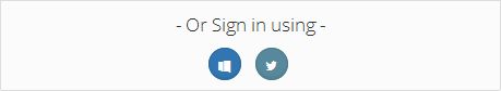
- Allow users to sign in using Twitter account – Enable or disable the option for users to Sign In using an associated Twitter account. A Twitter icon hyperlink will be visible or removed from the login page depending on this selection.
- For more information on Twitter integration, please view the page on ServicePRO Web - Twitter Account Integration for Sign Up.
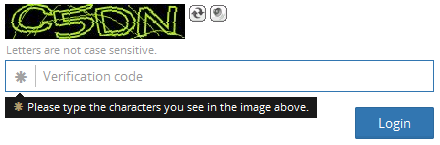
- CAPTCHA available – Enable or disable CAPTCHAs used for secure logins.
Theme Tab
Adjust visual aspects of the application, including color scheme, header logos, displayed support information and content displayed on the login page.
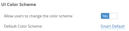
UI Color Scheme
Edit the following options associated with changing color and UI schemes:- Allow Users to change the color scheme
- Default color scheme – Select the default color scheme used for ServicePRO ServicePRO Web. Select from one of the following:
- Smart Default – White header, black side bar, white icons
- Dark Elegance – Dark blue headers and sidebar, red icons
- Ultra Light – Dark blue header, white side bar
- Google Skin – Orange header with gradients, blue UI icons, side bar options separated with lines
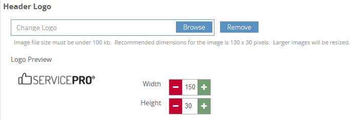
Header Logo
Users can upload an image file to use as the header logo, and preview the image used.- If no image is selected, the default logo will be used.
- The file size limit for logos is 100 kb.
- Logo height/width can be adjusted using the +/- icons.
- Width and height +/- icons go up to a maximum of 150 x 100 px
Company Support Information in Home Page Header Widget
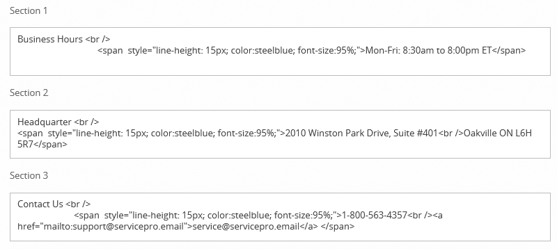
In this section, Users can edit the content for three section columns in the header of the Home Page.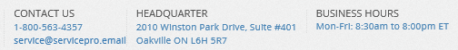
Content may consist of pure HTML code, including formatted text and images. By default, the initial available content includes business hours, company location, and contact information.
- Section 1
- Section 2
- Section 3
Preview panels
Preview the contents of the three sections as they would appear to users.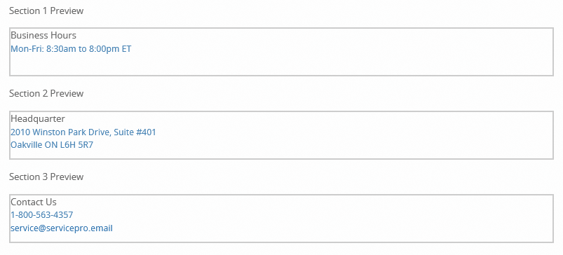
Truncate or Wrap Support Information Text
Administrators are able to customize the way content is displayed in Headers with Portal Design fields.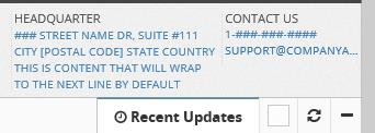
Contents of these fields can either be wrapped or truncated using CSS properties and attributes.
Wrapping
Words will break or wrap around to the next line, staying within set size boundaries of the field. Wrapping words can be done by assigning a break-word attribute within the div containers.
Sample HTML input for wrapped content
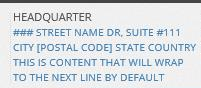
Headquarters
<br/>
<div style="line-height: 15px; color:steelblue; font-size:95%; word-wrap: break-word; white-space: pre-wrap;">
       ### Street Name Dr, Suite #111
       <br/>
       City [Postal Code] State Country This is content that will wrap to the next line by default
</div>
Truncating with Ellipses
Words will be cut off if they approach the text field boundaries. Ellipses will indicate that the text features additional information. Truncating in these fields can be done by adding a class=”truncate” attribute to the line that needs to be truncated.Sample HTML input for truncated content with ellipses
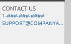
Contact Us <br/>
<div style="line-height: 15px; color:steelblue; font-size:95%; display: inline-block; width:100%;">
       1-###-###-####
       <br/>
       <a href="mailto:support@servicepro.email" class="truncate" style="width:100%; display:inline-block;">support@companyexamplewithlongname.com</a>
</div>
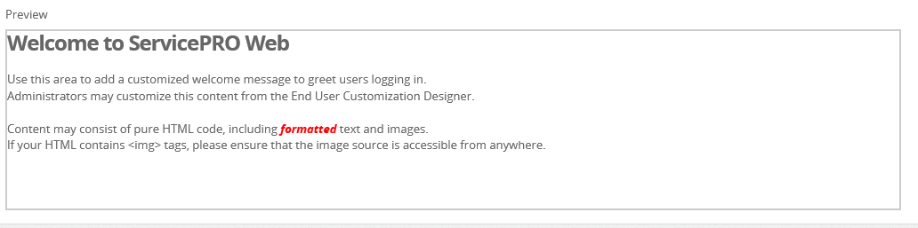
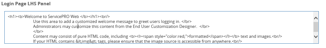
Login Page: Welcome Message and Left Panel
In these sections, Privileged users can edit the following contents:- The graphic that appears on the left side of the Login Page upon startup.
- The upper left header text.
- The right header text above the Login panel.
Users can add a customized welcome message to greet users logging in in both sections. Content may consist of pure HTML code, including formatted text and images.
If the HTML contains any img tags, please ensure that the image source is accessible from any location.
Preview
In this section, Users can preview the Login Page’s HTML content as it would appear to visitors to the page.